These illusions show me the limitations of the human senses. Visual, upon which I rely heavily, is not as reliable as I once thought it to be. It tries to correct things automatically or compensate, which can really be confusing. For example the illusion with the two gray tiles and the pillar casting a shadow is unbelievable. Without the proof I don't know if I would have ever believed it. It's a great trick, and even after I know it I still can't wrap my mind around it. There is not just one clear explanation for why our minds are ill-percieved with this particular image, but what I understood was two things:
- If a gray square is surrounded by lighter objects it appears darker because the eyes compensate for all that surrounding brightness. The opposite happens when a gray square is surrounded by darker objects. It's easy to see why such an effect would happen if this is true. But it is really exaggerated here.
- The second has to do with the fact that you can clearly see a shadow is being cast from that green pillar and the fuzziness of the shadow itself. This misleads you into thinking ignoring the shade change caused by the shadow. You simply dismiss it and try to figure out what color it is really supposed to be without the shadow.
There were tons of other illusions like the curveball, which was really something. And even more that made dots disappear and fish wiggle and ladders swing at different rates and all sorts of nonsense that my brain could not keep up with. The designers must have been out of their brainstalks for some time now.
I like the colorblind tests because it allowed me to better appreciate that minority of people who do suffer from such a condition. My father is actually one of them, and he tells me the grass is what I call purple. I think he's making that up. But some of those color inversions actually looked pretty spectacular. I think I prefer my normal vision (at least I can pilot planes), but one of the rarer conditions of colorblindness was a neat color scheme.
 |
| Which number do you see? I only see a snowman. |
The colors of the respective pHs were as follows:
1: Deep pink
3: Lighter pink
5: Pale pink
6: Light Magenta
7: Cobalt Blueish
8: Light Blue
9: Aquamarine
10: Kelly Green
11: Forest Green
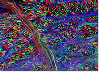
They look just like the results of my classmates'! (The brainbow was radicool.)
 |
| Ye Olde Brainbow |
Rods probably see green best. I've seen biker vests and caution signs. They use a color called "safety green" which is a pretty obvious color to the human eye. As it turns out, Wikipedia agrees.
Chlorophyll and anthocyanin have many carbon rings, multiple function group possibilities, cations, and oxygens in common. The fact that they aren't very good at absorbing green light, but are good at absorbing red and blue light, is why it appears green. There molecular shapes are pretty big and have some carbon circle things with oxygens. What else can I say about them? It's probably the double bonds that are everywhere.
And when bleach or hydrogen peroxide comes into they remove the color because those double bonds, which contribute to the color, are taken away. If you have a grass stain you can kiss it goodbye with new extra strength Clorox bleach! Because the chlorophyll's double bonds are taken right away, leaving your socks white as when you first took them out of the box.
Molecules in colorful fruits and vegetables might function as anti-oxidants because those colorful foods have colorful molecules, which have double bonds, which can deal with those pesky oxidants.

No comments:
Post a Comment